
Finding it difficult to marry the clean symmetry of round pearls with the distinctive character of baroque pearls without the result feeling mismatched? This guide outlines practical design choices to help you mix pearls and gemstones with confidence, covering shape pairing, size balance, surface contrast and harmony of colour, lustre and tone.
Learn how to match pearl shapes with complementary gemstone cuts, balance proportions for visual harmony and contrast surfaces to add tactile interest. Discover how to harmonise colour, lustre and tone, and how to compose focal points for wearable impact. Simple rules and practical pairing suggestions will help you translate these principles into pieces that feel cohesive on the body and sit comfortably with your personal style.

How to pair pearl shapes with complementary gemstone cuts
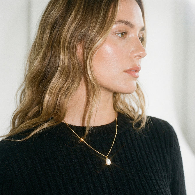
Pair round pearls with round, oval or brilliant-cut gemstones so the symmetrical shapes reinforce one another. Choose a gem that is slightly smaller than, or equal in apparent size to, the pearl to keep the pearl as the focal point, and set the gemstone to reflect light onto the pearl to enhance its lustre. When a pearl shows softer nacre, favour high-facet-count brilliant cuts; if a pearl already has a strong surface sheen, opt for cabochon, rose or stepped cuts so they do not compete visually. Baroque pearls sit well with freeform, pear or marquise cuts that follow the pearl's contours — orient the gemstone to mirror the dominant curve and use asymmetry deliberately to create an organic composition. Plan settings to suit each shape, using bezels or flush fittings around irregular edges and prongs for precise facets, and create a mock-up to check alignment, light interaction and wearability before you finalise.
Introduce contrast by placing angular cuts, such as emerald or princess cuts, beside smooth spherical pearls to accentuate each element. Balance visual weight by varying stone size or the number of accent gems so the composition feels cohesive. When creating mock-ups, align a gemstone's axes with the pearl's principal lines to control reflections and sightlines. These considered choices allow the pearl to remain the focal point while the gemstone contributes sparkle, structural definition or a sense of organic movement depending on cut and setting.
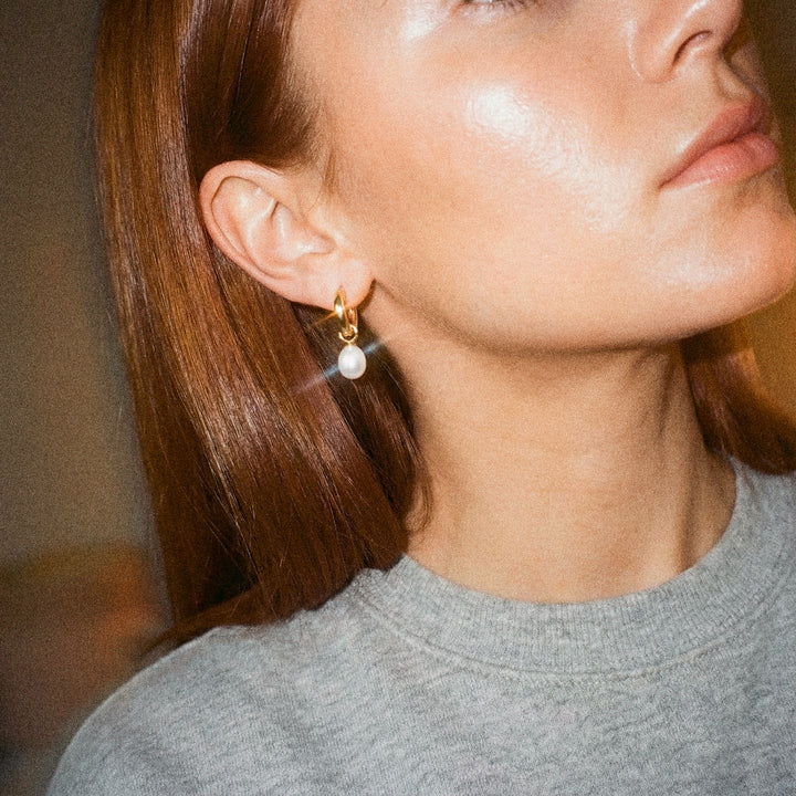
Choose sculptural, organic hoops to emphasise pearl contours.

How to balance sizes for harmonious visual composition
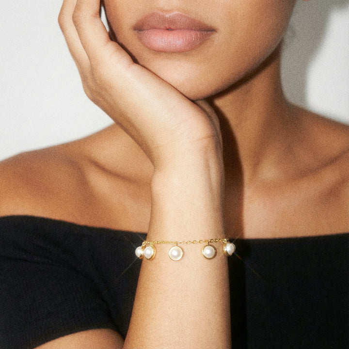
Begin with a clear focal strategy. Place one or two larger baroque pearls as anchors, then surround them with smaller round pearls and gemstone rondelles to frame the focal points. Test arrangements on a mock-up to ensure the eye is drawn to the intended area. Maintain contrast by applying relative size ratios, selecting gemstones about half to two thirds of the diameter of the largest baroque pearl so the stones complement rather than compete. Alternatively, use the rule of thirds to position beads so no single element dominates the composition. These steps establish a defined centre of interest while keeping visual clutter to a minimum.
Create a gentle rhythm by graduating bead sizes from large baroque pearls through medium rounds to small gemstone spacers; this guides the eye along the piece even in asymmetrical layouts. Soften the scale around irregular baroque shapes with small metal spacers or knotted segments, and widen spacers beside larger pearls to avoid crowding. Compensate for differences in density by distributing heavier stones evenly, knotting between large beads for both security and comfort. Finally, test the finished length on the body to ensure the visual centre sits exactly where you intend.
Anchor designs with classic baroque pearl studs

How contrasting finishes can enhance the tactile appeal of jewellery
Faceted gemstones scatter light and feel crisp to the touch. High polish round pearls reflect smoothly, while baroque pearls present irregular planes that diffuse light. Select one dominant reflective quality and use the other as an accent, or alternate elements bead by bead to balance sparkle with texture. Match metal finishes to the surface language: pair hammered or brushed metal to echo baroque ridges, use high polish bezels to amplify round pearl lustre, or choose oxidised surfaces to subdue bright stones. Test small metal swatches alongside pearls under both diffused and directional light to confirm the intended effect. These observations will guide your choices on polish levels and the degree of contrast that reads as tactile interest rather than visual clutter.
Allow the natural contours of baroque pearls to remain visible by using partial bezels or cups. Choose prong settings for faceted stones to maximise light and sparkle, and where metal meets skin use soft backings or rounded edges to ensure comfort. Alternate smooth, round pearls with irregular baroque beads, combine faceted gemstones with cabochons, and stagger sizes by a few millimetres so the tactile sequence reads as a considered rhythm rather than random variation. Photograph the piece from a slight angle and inspect combinations under a loupe or strong side light. Wear a prototype to assess how textures sit against the skin and how settings influence the overall interplay of surfaces.
Try a twisted gold stud to amplify pearl lustre.

How to harmonise colour, lustre and tone in pearl jewellery
Pair warm-toned pearls with warm-hued gemstones and cool-toned pearls with cooler stones. Examine samples together in neutral light and from several angles so subtle colour shifts become apparent as the piece moves. Introduce at least two tonal stops so components retain shape and depth; for example, anchor pale pearls with darker gemstones or lift deeper-hued baroque pearls with lighter stones. Finally, sketch the silhouette of the layout to test separation before finalising the design.
Play with lustre contrast to draw the eye: place high-lustre round pearls beside satiny baroque shapes, or surround a lower-lustre baroque with faceted stones to introduce discreet sparkle. Echo a chosen gemstone colour in small beads, spacer elements or metal details every two to four components to establish a rhythm that helps mixed shapes read as a cohesive design. Harmonise textures by pairing faceted cuts with irregular baroque surfaces, and smooth cabochons with round pearls so surfaces converse rather than compete. Keep gemstone diameters at roughly one third to two thirds of the pearl diameter to prevent either element overpowering the other and to maintain visual balance.
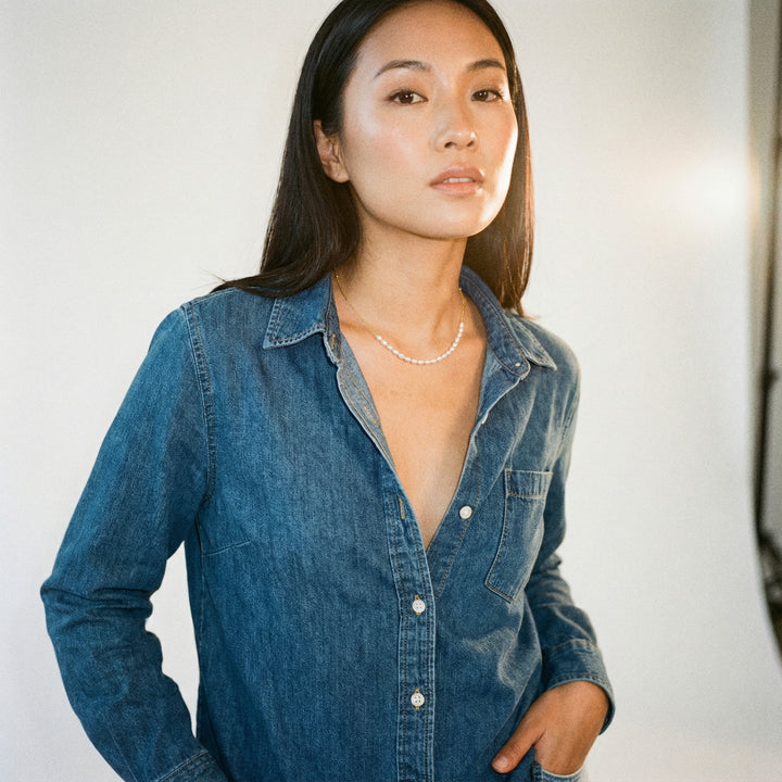
Add graduated pearls for instant tonal contrast.

How to create focal points for effortless wearable impact
A useful rule of thumb is to choose a gemstone about 30 to 50 per cent of the pearl's diameter when you want the pearl to remain the primary focus. Match the sizes for a shared focal presence, since size largely determines visual dominance. Play with surface and shape contrast: pair round pearls with faceted gemstones to introduce sparkle and crisp edges, and pair baroque pearls with cabochons or smooth cuts so the irregular silhouette remains distinct. Adjust emphasis with setting and metal: bezel or flush settings subdue a gemstone, while open prong or halo settings maximise light. Selecting a metal colour that echoes a pearl's overtone creates cohesion without adding visual weight.
Organise placement and negative space so the piece is anchored on the body, positioning focal elements at the centre or at the collarbone for wearability, or offsetting them to flatter an asymmetrical neckline. Allow clear space around the focal element at least equal to the diameter of one pearl so it reads as intentional rather than cluttered. Consider how the eye prioritises edges and highlights when deciding the layout. Match or contrast colour thoughtfully by choosing stones that echo a pearl's subtle overtones for harmony, or by selecting complementary hues for greater impact. View the ensemble in natural daylight and in typical indoor light, and photograph the arrangement on a neutral background to confirm the intended hierarchy before final assembly.
Combining round and baroque pearls with gemstones requires considered choices about shape, scale, surface and colour to keep a piece cohesive and wearable. Opt for symmetrical cuts to sit harmoniously with round pearls, orient freeform or pear-shaped gems to echo baroque curves, and balance size proportions and lustre contrasts so each element complements rather than competes.
Treat the headings on shape pairing, size balance, surface contrast, colour and tone, and focal composition as a checklist when you mock up designs and choose settings. Photograph prototypes in soft, neutral light, then try them on to observe where the eye naturally rests. Refine settings until the visual hierarchy reads clearly when worn.