
A freshwater pearl should take centre stage, yet metal texture can either amplify its glow or vie for attention. How can you introduce tactile metal accents without overshadowing the pearl?
Practical guidance for setting the pearl as the visual anchor, choosing metals and finishes that flatter its colour, and introducing textures that enhance rather than compete. It also outlines how to balance scale, proportion and placement, and considers construction, wearability and care, ensuring the pearl remains the focal point when worn.

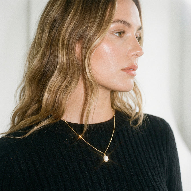
Let the pearl take centre stage in your outfit
Select a metal tone that complements the pearl's colour. Use cool metals for white, silver-tinged or grey pearls, and warm metals for cream or rose pearls. Check pairings by placing metal swatches beside the pearl in natural light so the nacre remains the focal point. To manage reflectivity, favour satin, brushed or hammered finishes that scatter specular highlights and let the metal support rather than compete with the pearl. Keep a few small polished accents to catch the eye without overpowering the surface. Maintain a restrained metal scale and profile: make bezel rims, prongs and crowns roughly 10 to 25 per cent of the pearl's width, and favour low-profile, open settings that reveal more of the pearl. These choices preserve the pearl's centred shape while allowing the metal to act as a complementary frame.
Introduce subtle inward-pointing textures, radial grooves or granulation, and carve or retain negative space around the genuine pearl so the metal frames the centre rather than competing with it. Validate designs under real conditions by photographing pieces in diffused daylight and in warm indoor lighting, and by viewing them at typical wearing distances to confirm the pearl remains the focal point. Consider a gentle patination or controlled oxidation in recessed areas to increase contrast, and test finishes for wear and skin contact to ensure they remain durable and comfortable.
Let cool silver frames enhance the pearl's natural glow

Select metals and finishes that flatter the pearl
Start by matching the metal tone to the pearl's overtone. Place small swatches of cool, warm and neutral metals beside the pearl in soft natural light and photograph the arrangement to see which metal casts the most complementary hue into the nacre. Use contrast of finish to enhance perceived lustre: set the pearl against a matte or satin surround to reduce competing highlights, and reserve highly polished accents as small points of reflection that echo the pearl's sheen. A muted surround can make smooth nacre appear more luminous, whereas continuous high polish may visually compete with the pearl's surface. Let these visual and photographic tests guide your choice so the metal enhances the pearl's natural colour and keeps its dominant shape centre stage.
Minimise metal bulk by choosing thin bezels, tapered prongs, low-profile cups and open-gallery settings that reveal negative space, allowing the pearl to remain the focal element at normal wearing distance. Introduce micro-texture such as micro-brushing, fine milgrain or small hammered facets at a scale finer than the pearl's surface grain so the metal functions as a subtle frame rather than a competing pattern; always view the detail at arm's length to confirm the effect. For durability, favour satin or brushed finishes to conceal everyday scratches, avoid deep oxidised treatments in areas of frequent skin contact, and run wear tests on prototypes to anticipate how plated or finished surfaces may alter the pearl's perceived colour with use.
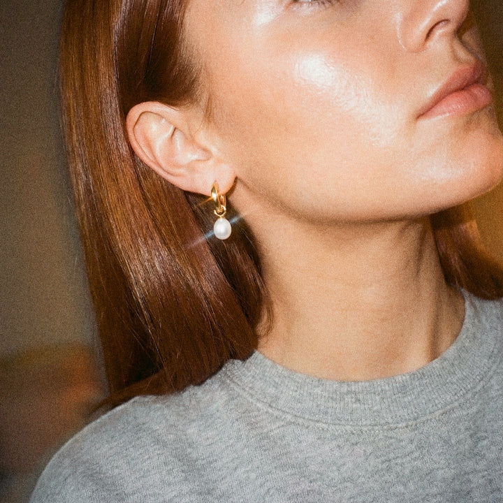
Toggle between minimalist hoop and pearl drop instantly

Apply metal finishes and techniques that enhance rather than compete
Opt for low-reflective finishes such as satin, brushed or microbead blast immediately around the pearl, as these absorb stray highlights and allow the pearl's lustre to read stronger. Reserve high polish for more distant accents to provide contrast without competing with the centre. Match the scale of texture to the pearl's size: employ fine granulation, delicate hammer marks or hairline milling for smaller pearls, and broader, bolder textures for larger examples, since textures finer than the pearl's surface will visually recede and preserve the dominant form. Use directional textures and sculpted profiles to guide the eye inward.
Radiating brushing, tapered grooves or a subtly concave bezel channel light inward, increasing perceived depth and making the central form the focal point. Introduce negative space and recessed fields by leaving a narrow, smooth halo or polished collar around the pearl, texturing the surrounding planes or grooves and using raised or recessed layers so the pearl reads as elevated against a textured backdrop. Tailor metal colour and selective darkening to complement the pearl's overtones: cooler finishes accentuate white and blue hues, warmer tones bring out cream and gold overtones, and gentle oxidation in crevices adds depth without competing with the pearl. Always review samples under diffused light and on the skin to judge the combined effect, adjusting contrast, texture scale or colour as required.
Choose gold-plated studs to warm pearl overtones.

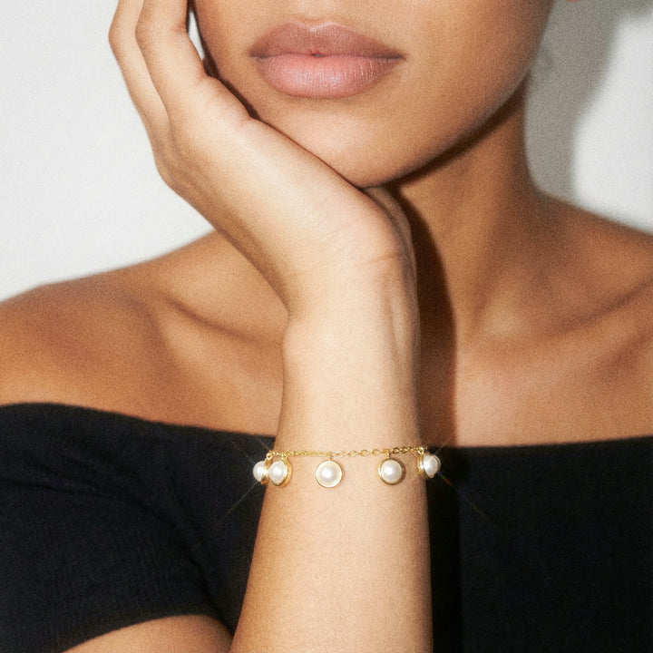
Balancing scale, proportion and placement to keep the pearl centre stage
Choose metal finishes that absorb rather than reflect light so the freshwater pearl remains the dominant element. Matt, brushed or micro-etched textures reduce specular highlights, allowing the pearl's lustre to register as the brightest feature. Place a satin or micro-etched surround immediately beside the pearl to minimise glare, and restrict individual texture motifs, such as hammer marks, facets or granules, to roughly 30 to 50 per cent of the pearl's diameter so they read as detail rather than focal points. Confirm the visual balance with mock-ups or scaled drawings before moving to production.
Consider guiding the eye inwards with radial, tapered or concentric textures that diminish in size or density towards the pearl. Sketch these flows so tooling and dies can follow the intended convergence. Increase perceived lustre by introducing tonal contrast: darkened or oxidised recesses between granulation or textured elements deepen shadows and make the pearl appear brighter and more three dimensional, while keeping the immediate rim uncluttered to avoid visual competition. Apply patina sparingly in grooves or between granulation where contrast will support the central focus, rather than across the visible halo. Reserve a smooth bezel or halo equal to a clear fraction of the pearl diameter, then add texture beyond that margin. Prototype at full scale to assess how texture density and spacing affect apparent size and focus.
Choose a warm gold frame to enhance pearl lustre.

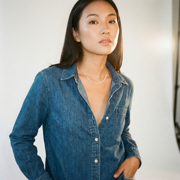
Design, construction and wearability: caring for pearls to preserve their lustre
Choose metal finishes that enhance a pearl's lustre. Fine satin or micro-etched textures scatter light and sit visually behind a satiny pearl, while a high polish produces strong highlights that can draw the eye away. Use hammered or shot textures sparingly as small accents to introduce delicate micro-reflection without creating a competing surface plane. A lightly reflective concave backing or a mirror-polished halo will gently direct light into the pearl and boost perceived lustre. Control proportions by favouring thin bezels, recessed seats or low-profile collets, and make full-size prototypes to confirm the pearl remains centre stage from typical viewing distances.
Minimise the visible metal footprint by incorporating open galleries, slim shanks and narrow connectors so the metal frames the pearl rather than competes with its form. Prioritise wearability by balancing the centre of gravity, aligning posts and clasps to prevent rotation, and selecting a metal hardness that resists deformation while still permitting a secure setting. Test prototypes for snagging by drawing representative fabrics across the piece, then refine edges and surface textures to ensure comfort and preserve the intended tactile finish. Specify care guidance that advises against ultrasonic cleaning and harsh abrasives, and recommend a mild soap, a soft cloth and gently warmed water for routine cleaning. Record replating or repolishing limits, and schedule setting inspections to re-tension pegs or prongs rather than increasing bezel size.
Let the freshwater pearl remain the visual anchor by matching the metal tone, managing texture and reflectivity, and keeping the metal scale restrained so it frames rather than competes. Opt for matte surrounds, subtle micro-texture and low-profile settings. Test prototypes under diffused, warm light to confirm the pearl stays the focal point while meeting durability and wearability requirements.
Assess pieces as they would be worn, noting any patina or signs of contact wear, and establish gentle cleaning and inspection routines to preserve their appearance. Apply these principles when selecting materials, arranging textures, and refining proportion and construction to enhance perceived lustre, ensuring the pearl remains the unmistakeable focal point.